
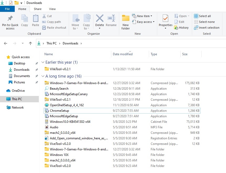
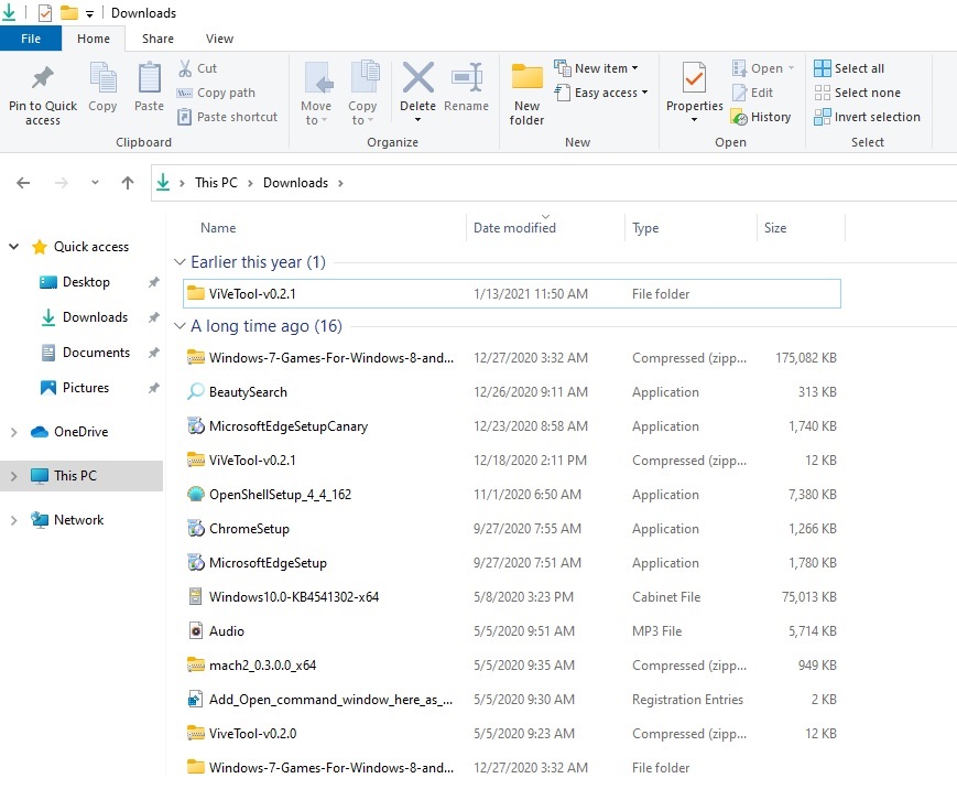
A lot of things have changed on Windows 10, but File Explorer has largely remained unchanged and it’s technically the same for more than a decade now if you exclude the dark mode update.
The company has been cautious about making design tweaks to the File Explorer, but this will change with the next update, presumably the Sun Valley update, which will include additional improvements for the default file manager.
Microsoft has confirmed that Windows 10 version 21H2 will come with an improved File Explorer which ties in closely with the company’s Fluent Design approach, and we’ve just got a glimpse of that refreshed interface in the technical preview builds.
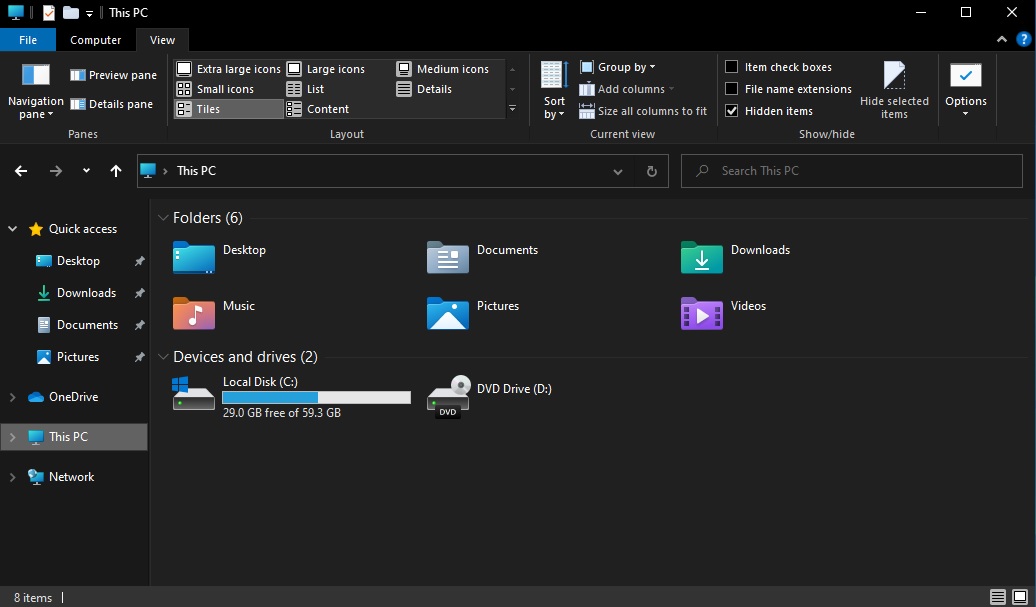
File Explorer, as we all know, allows you to browse through the folders and files on your machine. By default, the layout of the File Explorer is optimized for the desktops. If you use a tablet, you need to switch to tablet mode to access the touch-friendly interface with extra padding.
Microsoft is now planning to enable touch-friendly UI for everyone by default, even if you’re using a mouse. As you can see in the screenshot below, this new default look of Explorer adds additional padding between elements.
This should allow users to easily navigate between different pages of File Explorer when using a touch screen. The level of padding is automatically adjusted when you change the resolution of the device and it is designed for better consistency with modern (XAML) experiences.
Presumably, other UI elements that have padding around the edges will also get optimized for the touch experience.
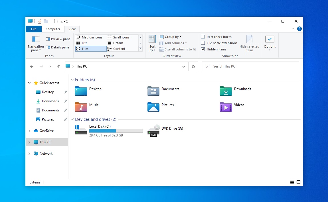
If you prefer the old layout, you can switch back by enabling a new toggle “Use compact mode” in the “View Options” window.
Modern icons in File Explorer
As you can see in the screenshots, Microsoft is also working on new icons for nearly all File Explorer-related folders and elements. This includes downloads, documents, pictures, videos, music, and other folders.
Microsoft is using different colours (rather than yellow and blue look) and these changes are in line with Fluent Design.
![]()
The icons for Recycle, Windows Run, Settings, even floppy disk have been modified as well, so they now have a touch of Fluent Design iconography.
The post Hands-on with Windows 10 File Explorer’s new touch UI and modern icons appeared first on Windows Latest
Via Windows Latest https://www.windowslatest.com