Windows 10’s most notable change is the addition of a new Start Menu, notifications center design borrowed from Windows 10X. The Start menu is centered, and Microsoft is also implementing rounded corners everywhere. Additionally, Windows 11 is getting a new Mica material that aims to improve the look and feel of the app windows.
According to Microsoft, Windows 11 aims to create a new design that truly feels like Windows, but it comes with an interface that is softer and decluttered. For example, it uses the Mica effect that allows the inactive app windows to fade into the background to help users stay focused.
Microsoft says they have tried to reduce clutter and touched all-important corners of the operating system. “We really wanted to design from the ground up without forgetting where we started. That iconic silhouette, the taskbar, the Start Menu. We heard from users, they wanted something that felt a little more natural,” the company said.

On its YouTube channel and Instagram, Microsoft has also given us a closer look at new animations for app icons and buttons.
For these new icons and apps, Microsoft looked at things like dimensionality, depth, light, typography, geometry and shape.
“New materials, new icons, new behaviors and interactions. Down to the literal pixel. We’ve thought about things in terms of natural lighting,” Microsoft said. “Good design. Good design is not just functional. It’s got to also be beautiful. Then when you touch the icon you also look at the topography and how do those fit together nicely.”
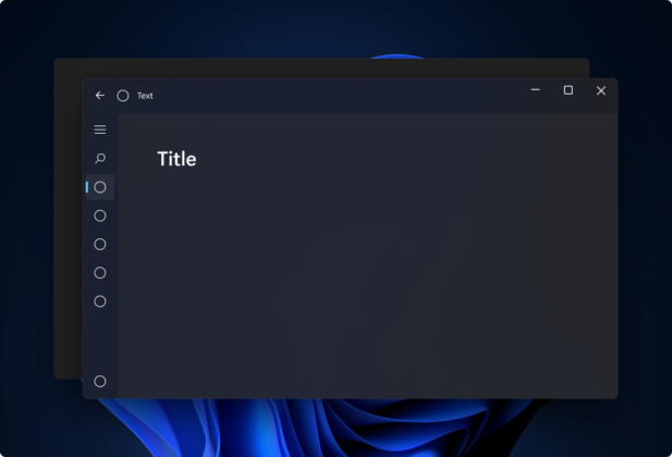
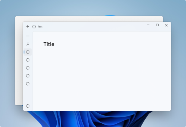
Mica is also one of the biggest changes that you’ll see on Windows 11. According to Microsoft officials, Mica is a material that would pick up the colour from your wallpaper and apply it to the title bar and other areas of the app, as shown in the below images.
Mica is noticeable only when it’s in focus and then it fades into background when that the window is inactive.
Windows Settings, File Explorer and other Windows 11 features are already using Microsoft’s new Mica material along with Fluent Design. In fact, Microsoft is also bringing Mica to Chromium Edge browser later this year.
The post Microsoft gives us a closer look at Windows 11’s design elements appeared first on Windows Latest
Via Windows Latest https://www.windowslatest.com
