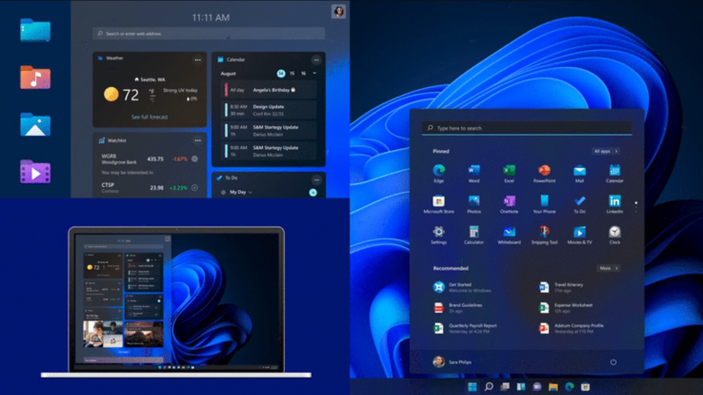
The next major version of Windows introduces a major overhaul of the UI. With Windows 11, Microsoft is ditching Start Menu’s live tiles that first debuted with Windows 8 in 2012 and introducing a new interface for Windows 10’s Action Center (notification center), taskbar flyouts, and more.
Windows 11’s redesign has been in the works for a while and it comes with major changes to the taskbar and Start Menu. The new Start menu has dropped live tiles for Windows 10X-like app icons, and taskbar icons are centered by default. Start, Windows Search, Action Center and other flyouts now float above the taskbar.
However, a new design doesn’t necessarily mean that it will work well for everyone. In a series of videos and interviews, Microsoft talked about a variety of aspects of the new design language and how it came to be. With Windows 11, Microsoft said it wanted to design an interface that tablet, desktop and large monitor users could take advantage of.
Windows 11’s redesigned Start menu and taskbar experience is the result of years of research and testing by a team of about 40 designers.

Should Start be left-aligned or center aligned? Should there be a search box? Should there be an all-apps list to start going to feel familiar? Microsoft’s research team argued over different designs when finalizing the search bar, weather, documents, and apps layout for the Start menu.
“It was really cool to see what all these different people were building. Like, what order did they put them in? You know, some people thought the weather was important but other people wavered on that. They were all a little bit different but one thing that they had in common: We always saw search files and applications together,” Microsoft’s designers explained in a video.
Speaking about the default alignment of the taskbar, Microsoft wanted to make sure that the “Start button felt efficient”. When working on centered taskbar and Start, Microsoft considered various form factors, including handheld tablets to full-fledged desktops, and ultra-wide monitors.
Microsoft decided to put the Start and taskbar icons in the center to address a design problem where the user actually need to travel in order to interact with the Start button on large monitors.
The post Microsoft explains Windows 11’s new Start Menu and taskbar design appeared first on Windows Latest
Via Windows Latest https://www.windowslatest.com