Microsoft has now started rolling out Windows 11 Build 22000.51 to testers in the Windows Insider program with centered Start menu, taskbar, and a new experience for Action Center/taskbar flyouts. In addition to these big improvements, Windows 11 also comes with a modern interface for File Explorer.
The overall File Explorer interface has remained the same since Windows 7. A ribbon was added with Windows 8, but it has mostly looked the same. This is going to change with Windows 11.
With Windows 11, Microsoft is not doing away with the classic or the current File Explorer app. The same Explorer will be shipping as part of the Windows update this fall, but it appears to have been updated with a modern Fluent Design-like UI on top of the existing app, and it looks different than before.
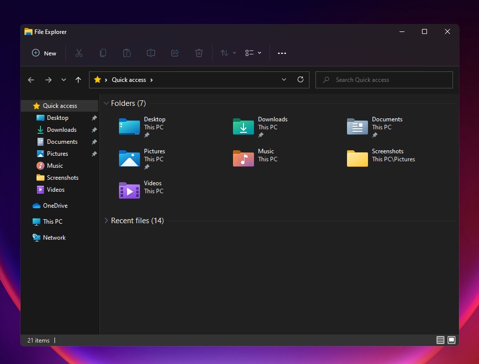
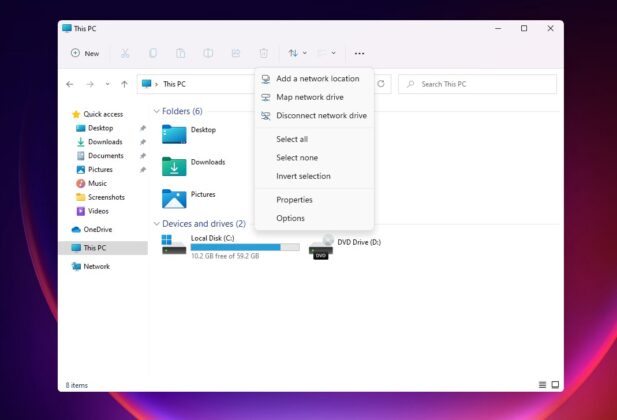
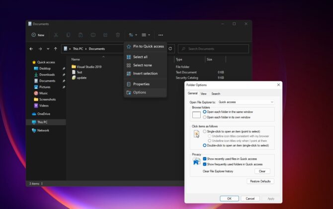
As you can see in the images above and below, there’s a new simplified menu called “command bar” and it looks to be based on WinUI. It has a clean interface and it’s visible at the top of the explorer window.
Microsoft has removed the Ribbon UI interface that was first introduced in 2012. The new command bar comes with these actions: create a new folder/file or shortcut, cut, copy, paste, rename, share, delete, apply filters, and switch layouts.
You can also click on the new eclipse menu that houses more features like options that let you customize the advanced features of Explorer. Most notably, the interface is now cleaner and acrylic transparency is now visible in certain areas.
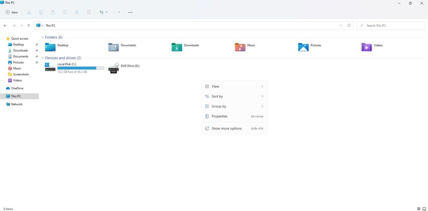
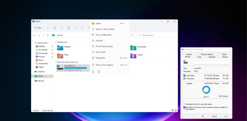
Microsoft is also working on a new modern right-click or context menu for File Explorer and desktop.
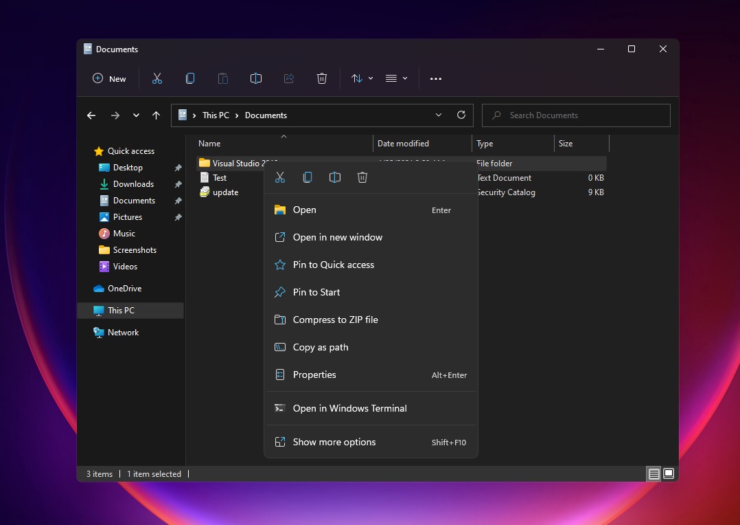
The context menu is currently limited in terms of functionality, but users can click on the “show more options” button to access the legacy context menu, which has been updated with rounded corners and shadow effect too.
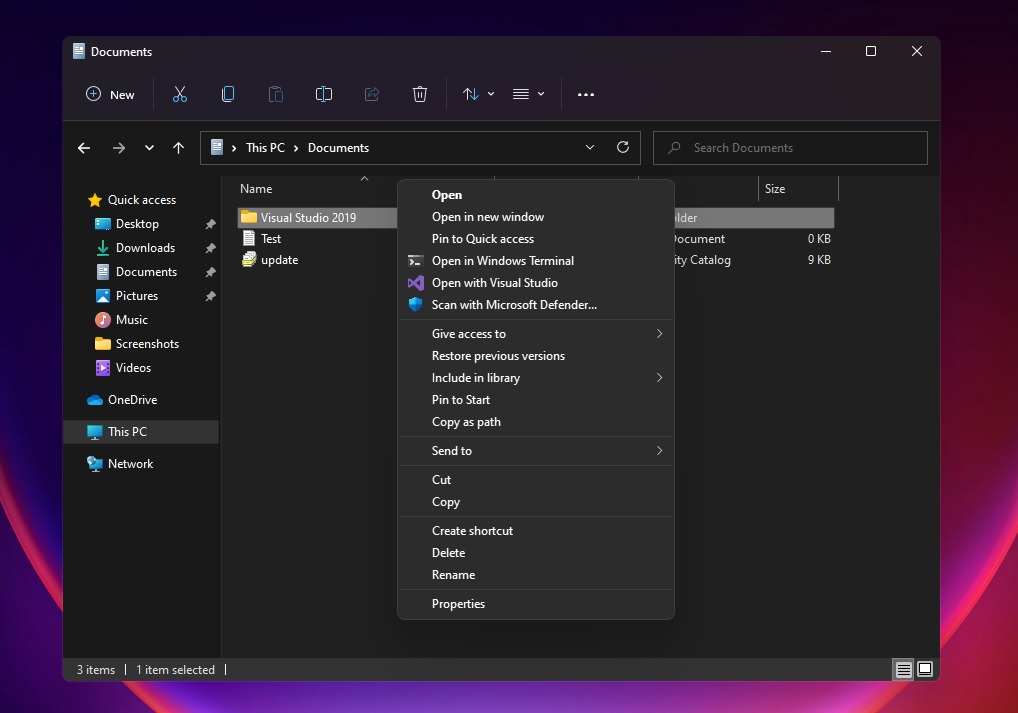
Microsoft is working on documentation for app developers to integrate their apps in the new context menu. It’s possible that the old context menu will be retired in future when all devs start using the new context menu.
Regardless, the new context menu is much cleaner and less cluttered than what we’ve currently, and it is also optimized for touchscreen devices.
If you can’t wait for Windows 11’s general availability, you can download and install Windows 11 preview builds today by joining the Dev Channel of the Windows Insider program.
What are your thoughts on the new File Explorer UI? Let us know in the comments.
The post Hands on with Windows 11 File Explorer’s command bar, context menu appeared first on Windows Latest
Via Windows Latest https://www.windowslatest.com