Since the launch of Fluent Design, there has been a lot of discussion about Microsoft’s future design direction, especially for Windows 10. Falling under the banner of the “Sun Valley” update, the highly anticipated “refresh” for Fluent Design is now gradually rolling out in the preview builds and app updates.
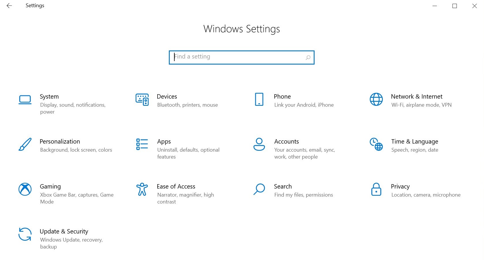
In the latest preview builds, Microsoft is enabling new system icons for Windows 10. Once updated, users will notice a refreshed Settings app with more rounded corners, which is part of the Fluent Design refresh.
The current old system icons will lose their sharp appearance for a very rounded and bulbous look that’s in line with the Redmond giant’s current plan to make the design more appealing. Hovering over these icons will also reveal the traditional Fluent Design effect.

Microsoft is using Segoe font for Fluent icons and these changes will be visible in the Start Menu, Settings app and other pages.

As shown in the above screenshot, only apps that rely on Segoe MDL2 assets will support more rounded, simplified and Fluent icons.
![]()
It’s worth noting that the iconography does not change dramatically between the October 2020 Update and the Sun Valley update, but the corner radius on buttons will change. For developers, Microsoft is also working on new guidelines for spacing, colour, rounded corners radius, and more to improve UI consistency across the operating system.
I’m also told that Microsoft is working on minor improvements for the Settings app to bridge the gap between the modern and legacy Control Panel pages. However, the Control Panel is not going anywhere, at least not this year.
Is the Sun Valley update all about rounded corners?
So far, rounded corners appear to be the main focus of the Sun Valley update, but Microsoft is also working on new features and quality improvements.
Based on the references spotted in the preview builds, we’re expecting the following improvements:
- Floating Start Menu, Jump List, Taskbar context menu, Action Center and more.
- Rounded corners for top-level windows.
- New touch, gestures and multitasking controls.
- Improvements for inbox (pre-installed) apps.
- Redesigned Action Center.
- New app switching experience.
- New optional Start Menu.
- New context menus.
- Dark mode improvements.
In internal documents, the Sun Valley project is also referred to as ‘Windows 10++’ and we’ll likely see features as the year progresses and especially as we head into the “What’s next for Windows” event where Microsoft is expected to announce the next generation of Windows and Windows 10X.
The post Windows 10 Sun Valley update reveals ‘refreshed’ system icons with Fluent UI appeared first on Windows Latest
Via Windows Latest https://www.windowslatest.com